
Campaign Concept
Overview
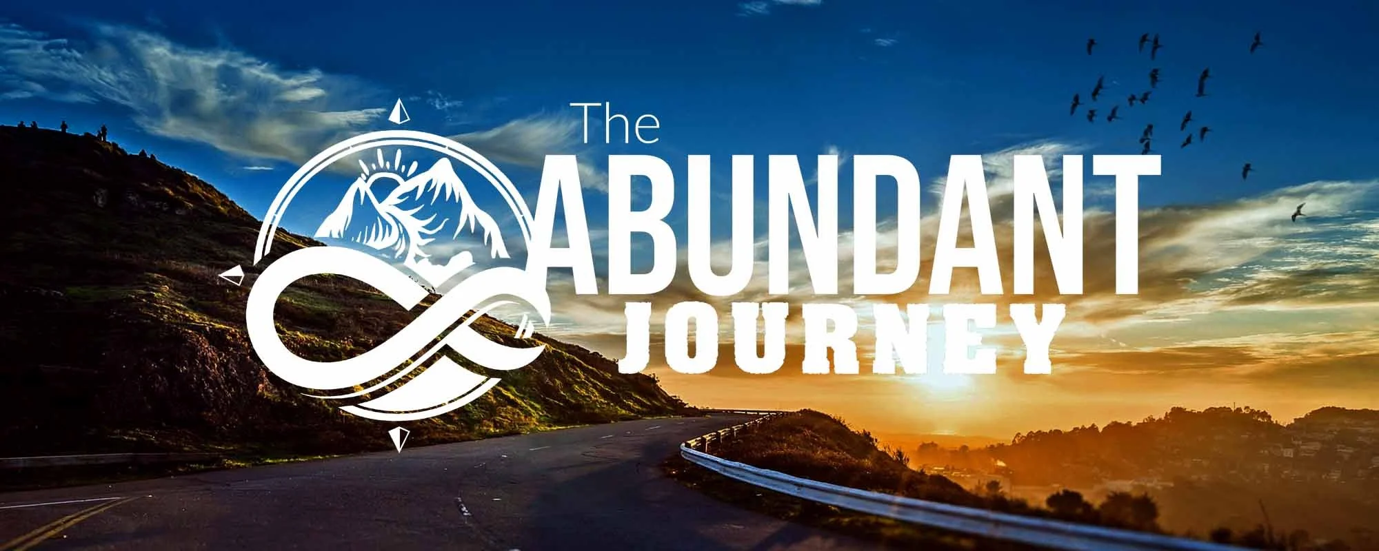
The Abundant Journey is a Gospel-centered travel community with a bold mission: to use travel as a vehicle for sharing the love of Christ. With a slogan like "Live a Life on Mission," their brand bridges faith, freedom, and purpose. This mock campaign was developed as a personal portfolio project, focused on highlighting conceptual strength, art direction, and alignment with faith-based audiences in the travel and nonprofit sectors.
The Challenge
How do you visually and verbally capture a lifestyle that blends spiritual purpose with road-bound adventure? The goal was to craft an ad campaign that felt authentic, aspirational, and missional—speaking to both seasoned travelers and believers searching for deeper meaning in their journey.
Project Overview
Client: The Abundant Journey
Role: Lead Designer, Art Director, Brand Strategist
Deliverables: Brand identity, (logo, color palette, typography), ad campaign
Tools: Adobe Illustrator, InDesign, Photoshop
The Solution
I developed a print campaign centered around four big-idea ads, each exploring a different emotional or spiritual entry point:
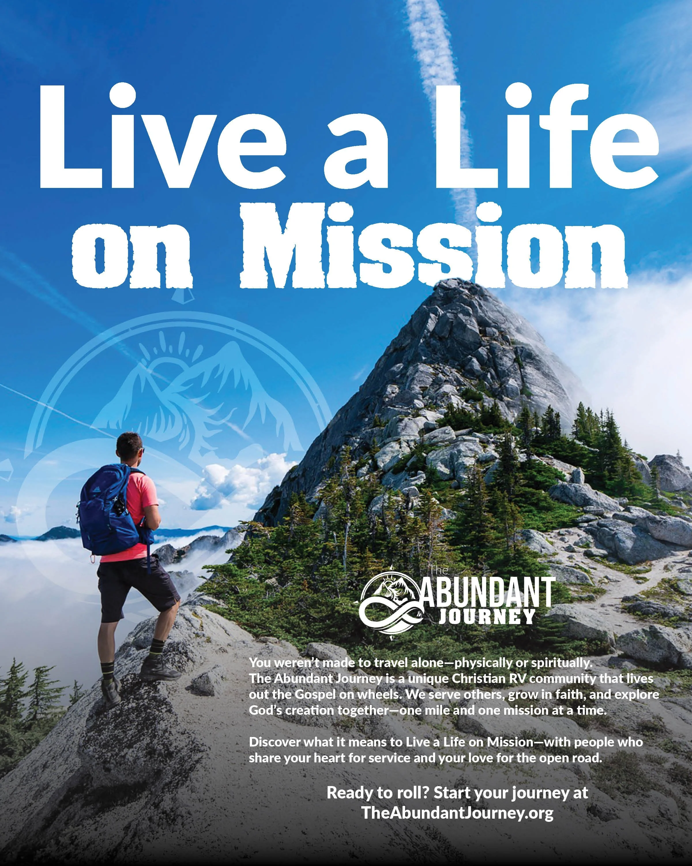
Live a Life on Mission
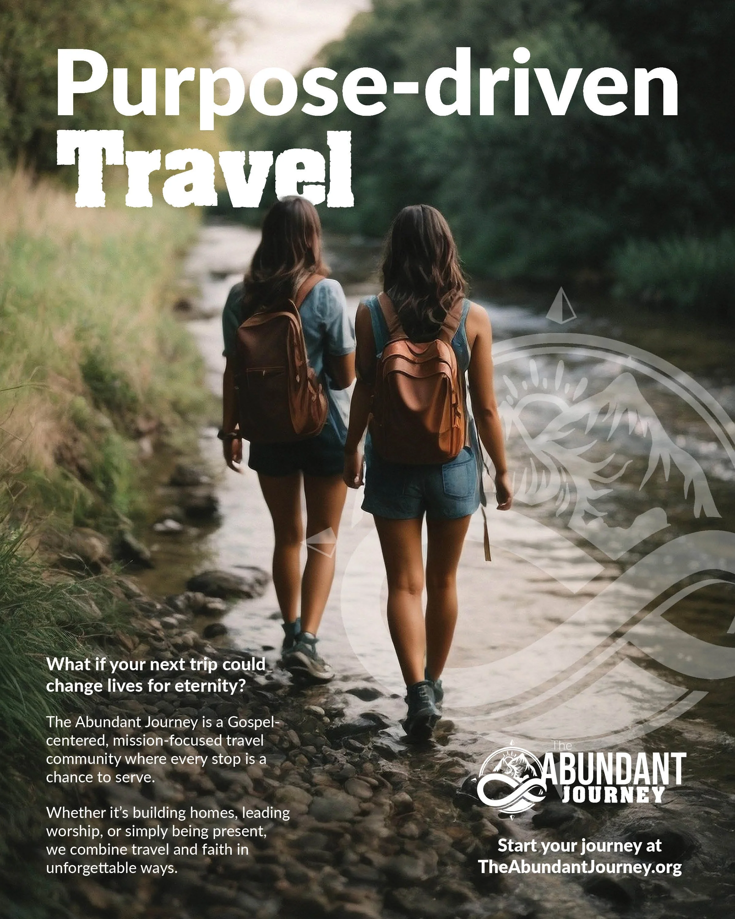
Purpose-driven Travel
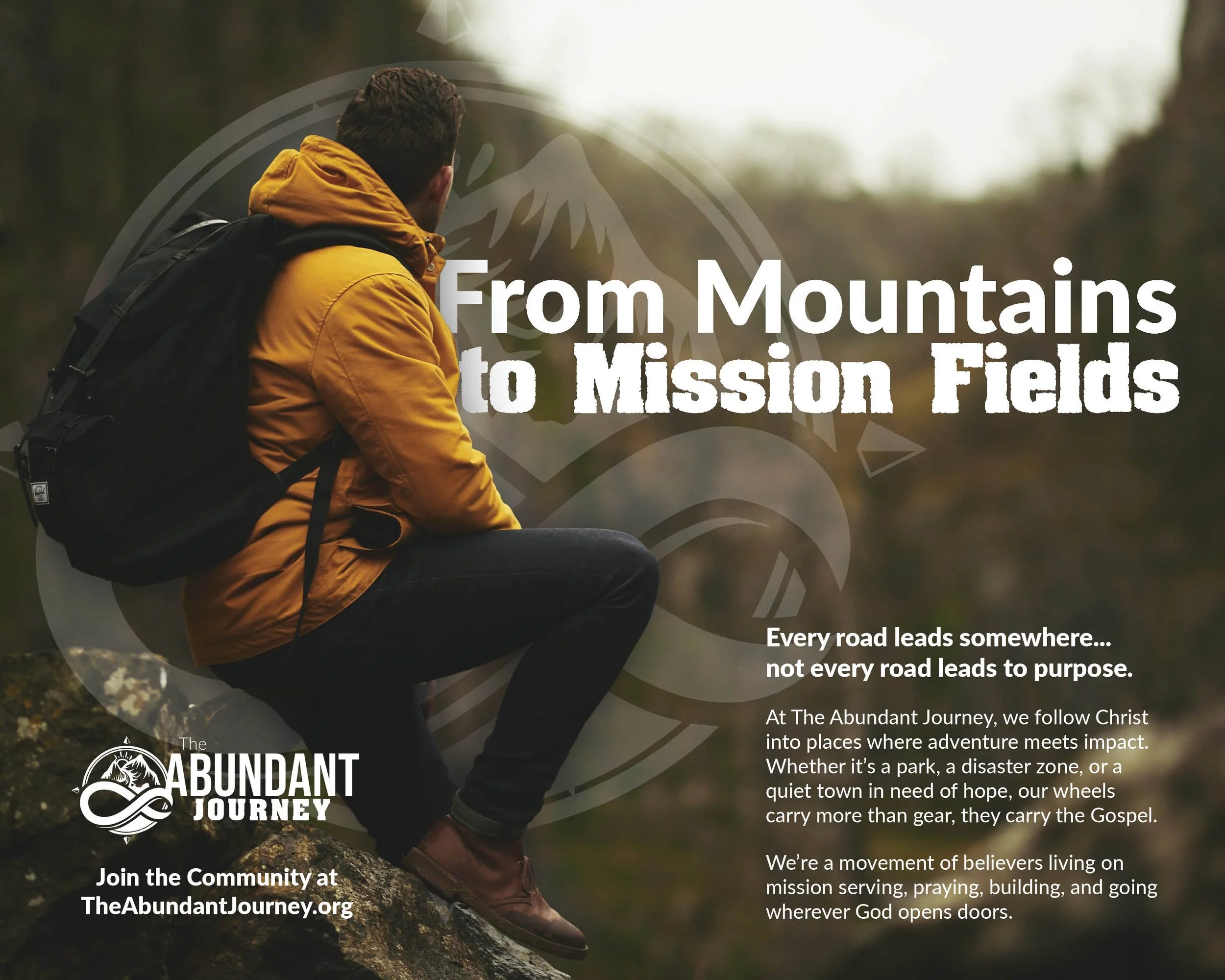
From Mountains to Mission
Each ad leans into the organization’s core identity: Gospel-centered. Mission-focused. Adventure-driven. Using warm, inspiring imagery and faith-forward copy, the campaign invites readers not just to join a group—but to answer a calling.
Creative Highlights
Headline Strategy
Each headline was designed to feel like a declaration of intent—clear, compelling, and missionally aligned:
Live a Life on Mission leverages the organization’s slogan to inspire and ground the viewer in their core message.
Purpose-Driven Travel connects spiritual intent with lifestyle aspirations.
From Mountains to Mission evokes visual movement and reinforces the idea that every destination can become a mission field.
Creative Highlights
Tone of Voice: Balanced inspirational language with clear calls to action, staying rooted in biblical mission without sounding overly institutional.
Design Direction: Clean layouts, full-bleed imagery, and typographic hierarchy reinforce the feeling of motion, openness, and community.
Audience Insight: Messaging was crafted to resonate with both retirees and digital nomads—those open to travel, seeking purpose, and living out their faith actively.